Original Cover
Whilst we wanted to still incorporate the image of the magpie as we imagined it could create a striking image and logo for the song and also addresses the bird imagery in the lyrics in a way that our video didn't. On the other hand our video is decidedly less vibrant than the colourful image above and is themed on homelessness in Leeds. Our video is in many ways a tribute to the city of Leeds and so it felt apt to include some form of Leeds imagery onto the digipak cover and create a grungier design blending Leeds and a magpie. To get this idea down I created the following concept design:
The concept was to take the black and white pattern of the magpie and make a minimalist image where the black spaces were filled with pictures of the Leeds skyline. I then turned towards Adobe Photoshop to begin to piece together a more professional looking image.
I started with a copyright-free photograph of a magpie, which I cropped so that it was just the magpie and not the rocky background. I then found an image of The Headrow, a street in central Leeds, with the Town Hall clock face prominent in the picture, and placed this underneath the magpie. I aligned the two so that the clock appeared where the magpie's face would be:
I then 'darkened' the magpie so that the Leeds backdrop would bleed through the black sections of the magpie while leaving the white areas intact. I then removed the rest of the Leeds background so there was a plain white backdrop.
Upon looking at the finished image, there was lots of blank space within the magpie that was taken up by plain sky on the Leeds picture behind it so I decided to layer an additional picture of Leeds within it. This made the magpie emblem more colourful and full of more interesting ideas. It also represented the sprawling urban landscape more effectively. Cropping the backgrounds out, I was left with the central magpie logo that would be used on our cover and magazine advert.
At this point my attention turned to arranging the logo within the digipak cover and adding text of the song name and band name. There was lots of discussion about the type of aesthetic we should add:
At first we tried adopting a minimalist style by using simple fonts and layout. Whilst I felt a white background would be more adequate for our logo, Melissa suggested we use a black background as this was more common of indie rock album covers. We also turned the logo black and white to reflect the black and white colour scheme common within album covers within the indie rock genre, and tried incorporating the band's original logo.
We then felt that the simple fonts were reading as too dull and so tried experimenting with a more vibrant style, incorporating bright neon colours and a vintage aesthetic. We quickly realised however that the results looked cheap and very different to the mood and style of our video.
We were annoyed by the fact that the magpie stands out too much against the black background, looking clearly photoshopped and unnatural. By turning the background back to white, this effect was reduced and the images turned out better. We decided to use a gradient background so as not to repeat the photoshopped look from before:
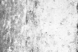
We preferred this look however the text and background both came across as highly bland so we looked online to see if there were any more interesting white background textures available. Thinking about the urban aesthetic, I searched for a concrete texture or something reminiscent of it and found an image that interested us:
Applying this concrete effect to our cover made the magpie look less edited and also added a grungier look more relevant to our video. We knew this was the background we were happy to include:
At this point we returned to the issue of the bland text. Stepping away from the minimalist aesthetic slightly, we looked for edgier and more urban fonts and tried them out on the cover. I also decided to introduce some colour, using a dark burnt orange to echo the colour inside the magpie. We tried various fonts and styles (including trying the band's original logo again, which looked too washed out against the background):
We eventually found a font we liked and initially tried making the font large and eye-catching:
But we noted that the font was bold enough to still be visible even in a small type size. When we made the text smaller and the same width as each other, the overall result was more elegant and quirky and this became our final version of the digipak cover which we consequently used:


No comments:
Post a Comment